



Q1 [10 points] Designing a good table. Visualizing data with Tableau.
a. [5 points] Good table design. You want to help a retail store analyze its global sales and profit in the years 2015 and 2016. Create a well-designed table to visualize the data contained in sales.csv. You can use any tool (e.g., Excel, HTML) to create the table.
For each year and for each region, your table should clearly communicate :
- The total number of units sold
- The total profit, rounded to 2 decimal places
- The item type with the highest sales, determined based on the total number of units sold. For example, suppose 70 units of Item A have been sold and 95 units of Item B have been sold; then item B is the one with the highest sales.
- If a region has only one item type sold in a year, then that item type has the highest sales.
- Percentage of total profit that comes from the item type with the highest sales, rounded to 2 decimal places (you need to calculate this percentage)
- Save the table as table.png
Note: If a region has no sales in a particular year, use ‘0’ for Total Units, Total Profit , Percentage of Total Profit and ‘NA’ for Item type with highest sales.
You may decide on the most meaningful column names to use, the number of columns, and the column order. Keep suggestions from lecture in mind when designing your table. You are not limited to use only the techniques described in lecture. For OMS students, the online lecture video pertaining to this topic is Week 4 – Fixing Common Visualization Issues – Fixing Bar Charts, Line Charts). For campus student, please review slide 43 and onwards of the lecture slides.
b. [5 points] Tableau.
You want to help your organization better understand the sales in different regions from different channels. Visualize sales.csv as a grouped bar chart. Your chart should display regions (e.g., Asia, Australia) along the horizontal axis and number of units sold along the vertical axis. Also show offline and online channels sales for each region.
Our main goal here is for you to try out Tableau, a popular information visualization tool. Thus, we keep this part more open-ended, so you can practice making design decisions. We will accept most designs from you all. We show one possible design in the figure below, based on the tutorial from Tableau, and you are not limited to the techniques presented there.
Instructions:
- Your design should be grouped bar chart, showing units sold for each channel for each region.
- Your design should have clear label axes and a clear chart title. Include a legend for your chart.
- Save the chart as barchart.png
Tableau has provided us with student licenses for Tableau Desktop, available for Mac and Windows. Go to tableau and select “Tableau Desktop”. After installation, you will be asked to provide an activation key, which you can find on the Canvas page for this assignment. This key is for your use in this course only. Do not share the key with anyone.
If you do not have access to a Mac or Windows machine, please use the 14-day trial version of Tableau Online:
1. Visit https://www.tableau.com/trial/tableau-online
2. Enter your information (name, email, GT details, etc)
3. You will then receive an email to access your Tableau Online site
4. Go to your Site and create a workbook
One final option, if neither of the above methods work, is to take advantage of Tableau for Students. Follow the link and select “Get Tableau For Free”. You should be able to receive an activation key which offers you a one-year use of Tableau Desktop at no cost by providing a valid Georgia Tech email. Note that it is unclear whether Tableau intends for these licenses to be renewable, so you may only be eligible to receive one in the event that you have never used a Tableau for Students license before.

Figure 1: Example of a grouped bar chart
Q1 Deliverables:
The directory structure should be as follows:
Q1/
table.png
barchart.png
sales.csv
- table.png – An image/screenshot of the table in Q1.a (png format only).
- barchart.png – An image of the chart in Q1.b (png format only), Tableau workbooks will not be graded!). The image should be clear and of high-quality.
- sales.csv – The dataset provided
Q2 [15 points] Force-directed graph layout
You will experiment with many aspects of D3 for graph visualization. To help you get started, we have provided the graph.html file (in the Q2 folder).
Note: You are welcome to split graph.html into graph.html, graph.css, and graph.js. Make sure that all paths in your code are relative paths. Nonfunctioning code will result in a five point deduction.
a. [2.5 points] Adding node labels: Modify graph.html to show the node label (the node name, i.e., the source) at the bottom right of each node in bold. If a node is dragged, its label must move with it.
b. [3 points] Styling edges: Style the edges based on the “value” field in the links array. Assign the following styles:
If the value of the edge is equal to 0, the edge should be blue, thick, and solid.
If the value of the edge is equal to 1, the edge should be black, thin, and dashed.
c. [3 points] Scaling nodes:
- [1.5 points] Scale the radius of each node in the graph based on the degree of the node (you may try linear or squared scale, but you are not limited to these choices).
Note: Regardless of which scale you decide to use, you should avoid extreme node sizes, which will likely lead to low-quality visualization (e.g., nodes that are mere points, barely visible, or of huge sizes).
Note: D3 v4 (and above) does not support d.weight (which was the typical approach to obtain node degree in D3 v3). You may need to calculate node degrees yourself. Example relevant approach: https://stackoverflow.com/questions/43906686/d3-node-radius-depends-on-number-of-links-weight-property
- [1.5 points] The degree of each node should be represented by varying colors. Pick a meaningful color scheme (hint: color gradients). The number of color gradations is up to you, but it must be visually evident that the nodes with higher degree use darker/deeper colors and the nodes with lower degrees use lighter colors. You can find example color gradients at Color Brewer.
d. [6 points] Pinning nodes (fixing node positions):
- [2 points] Modify the code so that when you double click on a node, it pins the node’s position such that it will not be modified by the graph layout algorithm (note: pinned nodes can still be dragged around by the user but they will remain at their positions otherwise). Node pinning is an effective interaction technique to help users spatially organize nodes during graph exploration.
- [2 points] Mark pinned nodes to visually distinguish them from unpinned nodes, e.g., pinned nodes are shown in a different color, border thickness or visually annotated with an “asterisk” (*), etc.
- [2 points] Double clicking a pinned node should unpin (unfreeze) its position and unmark it.
e. [0.5 points] Add GT username: Add your Georgia Tech username (usually includes a mix of letters and numbers, e.g., gburdell3) to the top right corner of the force-directed graph (see example image).

Figure 2a. Example Visualization with pinned node (orange)
Q2 Deliverables:
The directory structure should be as follows:
Q2/
graph.(html / js / css)
- graph.(html / js / css) – the html file created, and the js / css files (if you decide to save js and css in their own separate files)
Q3 [15 points] Line Charts
Use the dataset[1] provided in the file earthquakes.csv (in the Q3 folder) to create line charts.
Refer to the tutorial for line chart here.
Note: You will create four plots in this question, which should be placed one after the other on a single HTML page, similar to the example image below (Figure 3). Note that your design need NOT be identical to the example.
a. [5 points] Creating line chart. Create a line chart that visualizes the number of earthquakes worldwide from 2000 to 2015 (inclusively), for the four magnitude ranges: [‘5_5.9’, ‘6_6.9’, ‘7_7.9’, ‘8.0+’]. Use the color scheme provided below for the magnitude ranges. Add a legend at the top right corner of the chart showing the magnitude-color mapping.
- Chart title: Earthquake Statistics for 2000-2015
- Horizontal axis label: Year
- Use scaleTime like you did in HW1Q3
- Vertical axis label: Num of Earthquakes
- Use linear scale for this part a
- Colors scheme: {‘5_5.9’: ‘#FFC300’, ‘6_6.9’: ‘#FF5733’, ‘7_7.9’: ‘#C70039’, ‘8.0+’: ‘#900C3F’}
b. [5 points] Adding symbols and scaling symbol sizes. Create a line chart for this part (append to the HTML page) whose design is a variant of what you have created in part a. Start with your chart from part a. Then modify the code to visualize each data point in the chart as a solid symbol according to the Symbols scheme, whose size is proportional to “Estimated Deaths”. Use a good scaling coefficient (your choice) to make the chart legible, visually attractive and meaningful. Keep the legend.
- Chart title: Earthquake Statistics for 2000-2015 with Symbols
- Symbols scheme: {‘5_5.9’: circle, ‘6_6.9’: triangle, ‘7_7.9’: diamond, ‘8.0+’: square}
c. [5 points] Axis scales in D3. Create two line charts for this part (append to the HTML page) to try out two axis scales in D3. Start with your chart from part b. Then modify the vertical axis scale for each chart: the first chart uses the square root scale for its vertical axis (only), and the second plot uses the log scale for its vertical axis (only). Keep the legend and symbols. At the bottom right of the last chart, add your GT username (see Figure 3c-2 for example). In explanation.txt, explain when we may want to use such nonlinear scales as square root scale and log scale in charts, in no more than 50 words.
Note: the horizontal axes should be kept in linear scale, and only the vertical axes are affected.
Hint: You may need to carefully set the scale domain to handle the 0s in data.
- First chart
- Chart title: Earthquake statistics for 2000-2015 (Square root Scale)
- This chart uses the square root scale for its vertical axis (only)
- Other features should be the same as part b.
- Second chart
- Chart title: Earthquake statistics for 2000-2015 (Log Scale)
- This chart uses the log scale for its vertical axis (only)
- Other features should be the same as part b.
Figure 3a: Example line chart


Figure 3b: Example line chart with symbols

Figure 3c-1: Example line chart using square root scale
Figure 3c-2: Example line chart using log scale

Q3 Deliverables:
The directory structure should be organized as follows:
Q3/
earthquakes.csv
linecharts.(html / js / css)
linecharts.pdf
explanation.txt
- earthquakes.csv – the dataset.
- linecharts.(html / js / css) – the html file created, and the js / css files (if you decide to save js and css in their own separate files).
- linecharts.pdf – a PDF document showing the screenshots of the four line charts created above (one for Q3.a, one for Q3.b and two for Q3.c). You should print the HTML page as a PDF file, and each PDF page shows one plot (hint: use CSS page break). Clearly title the plots as instructed (see examples in Figure 3).
- explanation.txt – the text file explaining your observations for Q3.c.
Q4 [20 points] Interactive Visualization
Use the dataset state-year-earthquakes.csv provided in the Q4 folder to create an interactive line chart and sub-chart.
This dataset[2] contains the earthquake counts by U.S. state and region, in the years 2011 to 2015 (inclusively). In the data sample below, each row under the header represents a state, its region, year, and count of earthquakes.
state, region, year, count
Hawaii,West,2011,34
Hawaii,West,2012,40
- [3 points] Create a line chart.
Summarize the data by displaying the count of earthquakes by region for each year. You will need to sum the count of earthquakes by year for all states in their respective regions. Then, display one line for each of the 4 regions in the dataset.
Axes: All axes should automatically adjust based on the data. Do not hard-code any values.
- The vertical axis will represent the total count of earthquakes for a region. Display these values using a linear scale.
- The horizontal axis will represent the years. Display these values using a time scale.
- [3 points] Line styling, legend, title and username.
Lines: Each line should use a different color of your choosing to differentiate between regions. Display a dot shape over each data point in the line chart (i.e., a line should have one dot displayed for each year).
Legend: Display a legend on the right-hand portion of the chart that maps the line color to the name of the region.
Title: Display the title “US Earthquakes by Region 2011-2015” at the top of the plot.
Username: Add your GT username (usually includes a mix of lowercase letters and numbers, e.g., gburdell3) beneath the title (see example figure 4b).
The line chart should be similar in appearance to the chart provided in figure 4b.
Note: The data provided in state-year-earthquakes.csv requires some processing for aggregation. All aggregation must only be performed in javascript; you must not modify state-year-earthquakes.csv. That is, your code should first read the data from .csv file as is, then you may process the loaded data using javascript.

Figure 4b.Line Chart representing count of earthquakes by year for each region
Interactivity and sub-chart. In the next few parts of this question, you will create event handlers to detect mouseover and mouseout events over each dot shape that you added in Q4.b, so that when hovering over a dot, a horizontal bar chart representing the earthquake count for each state in a region will be shown below the line chart (for the year of that dot). For example, hovering over the dot for the West region in 2011 will display the bar chart for all states in the Western region and their individual earthquake counts in 2011. See Figure 4c for an example.

Figure 4c.Bar chart representing count of earthquakes for the Western region in 2011
- [5 points] Create a Bar chart
Use a horizontal design for the bar chart, with one bar per state in the selected region. Each bar represents the count of earthquakes for one state in the selected year.
Axes: All axes should automatically adjust based on the data. Do not hard-code any values.
- The vertical axis represents states in a region. The state names should be sorted in ascending order on the vertical axis where the state with the lowest amount of earthquakes is at the bottom and the state with the highest order of earthquakes is at the top.
Note: If a region has multiple states with an equivalent count of earthquakes, then order those state names in ascending alphabetical order. e.g., Alabama, Delaware, and Florida have 0 earthquakes in 2013. They will be ordered as:
|
… |
|
Florida |
|
Delaware |
|
Alabama |
- The horizontal axis represents the count of earthquakes for the selected year. Display these values using a linear scale.
- [3 points] Bar styling and title
- Bars: All bars should have the same color and a fixed bar width.
- Title: Display a title with format “<Region>ern Region Earthquakes <Year>” at the top of the plot where <Region>, and <Year> are the variables set by hovering over a dot in the line chart. e.g., If displaying earthquakes for the South in 2015, the title would read: “Southern Earthquakes 2015”
- [3 points] Mouseover Event Handling
- The barchart and its title should only be displayed during mouseover events for a dot in the line chart.
- The dot in the line chart should change to a larger size during mouseover to emphasize that it is the selected point.
- [3 points] Mouseout Event Handling
- The barchart and its title should be hidden from view on mouseout and the dot previously mouseovered should return to its original size.
The graph should exhibit interactivity similar to the .gif in Figure 4f.

Figure 4f.Line Chart+BarChart demonstrating interactivity
Q4 Deliverables:
- The size of the dot in the line chart should be reset.
The directory structure should be as follows:
Q4/
interactive.(html/js/css)
state-year-earthquakes.csv
- interactive.(html/js/css) – The html, javascript, css to render the visualization in Q4.
- state-year-earthquakes.csv – The datasets used to show the information of each state.
Q5 [15 points] Stacked Bar plot and select box
Relevant Example Visualizations: Stacked Bar Plot, Select Options
Use the dataset provided in earthquake.csv (in the Q5 folder) that describes the earthquake counts for different states for years 2017 and 2018 in the US. Visualize the data using D3 stacked bar plot. (Optional reading: the effectiveness of stacked bar charts is often debated — sometimes, they can be confusing, difficult to understand, and may make data series comparison challenging.)
- [2 pts] Create a file named stacked.html. Within this file, create a stacked bar plot of the earthquakes for different states. Place the state name on the horizontal axis and the earthquake count on its vertical axis.
- [3 pts] Stacks: Add stacks for each bar representing the number of earthquakes for a given state for the earthquake intensity 7.0+, 6-6.9 and 5-5.9 (as shown in the example visualization in Figure 5). Above each bar, display the total number of earthquakes in the state, for the year chosen in the select box (e.g., in Figure 5, the year “2017” has been chosen).
- [2.5 pts] Color: In a stacked-bar plot, color scheme is a very important design element that directly affects how easily different stack components may be differentiated. Use the following color scale:
- 7.0+ maps to color #b33040
- 6_6.9 maps to color #d25c4d
- 5_5.9 maps to color #f2b447
- [3 pts] Drop Down Select Box: Create a drop-down select box with D3 for selecting the year. Place it on top of the plot. When the user selects a year in this select box, the stacked bar plot should be updated with values corresponding to the selected year.
- [2 pts] Legend: Display a legend on the right-hand portion of the chart that to show the mapping between the stack colors and the earthquake intensities.
- [2 pts] Titles:
- Add the plot title “Visualizing Earthquake Counts by State” in 20px font size
- Add the y-axis title “Number of Earthquakes” and x-axis title “State”, both in 15px font size
- [0.5 pts]: Add your GT username (e.g., gburdell3) to the bottom-right corner of the plot.
Note: If you need to “reshape” the data provided, the reshaping must only be performed in javascript; you must not modify earthquake.csv. That is, your code should first read the data from earthquake.csv file as is, then you may reshape that loaded data using javascript, and then use it to generate the plot.
Note: Axes: Both axes must automatically adjust based on the data. Do NOT hard-code any axis values.
- The vertical axis will represent the earthquake count for the stacked bars.
- The horizontal axis will represent the state
Figure 5: example stacked bar plot

Q5 Deliverables:
The directory structure should look like:
Q5/
stacked.(html / js /css)
earthquake.csv
- stacked.(html / js / css) – the html file created, and the js / css files (if you decide to save js and css in their own separate files)
- earthquake.csv – the dataset
Q6 [25 points] Choropleth Map of State Data
Example of choropleth map: Unemployment rates
Use the dataset[3] provided in the file state-earthquakes.csv and states-10m.json (in the Q6 folder) and visualize them as a choropleth map.
- Each record in state-earthquakes.csv represents a state and is of the form <State,Region,2010,2011,2012,2013,2014,2015,Total Earthquakes>, where
- State: the name of the state. e.g., Alabama.
- Region: the region which the state belongs to. e.g., South.
- 2010,…,2015: the number of earthquakes in that state in 2010, …, 2015, respectively.
- Total Earthquakes: the total number of earthquakes in that state during 2010-2015 (the number of earthquakes in the state-earthquakes.csv file have been slightly modified from the original values and do not represent the official figures).
- The states-10m.json file is a TopoJSON topology containing two geometry collections: states, and nation.
a. [20 points] Create a choropleth map using the provided datasets, use Figure 6a and 6b below as references.
- [10 points] Load the data from state-earthquakes.csv and create a choropleth map such that the color of each state in the map corresponds to the log of earthquakes that occurred in that state for a particular year (we recommend that you use 2010). That is, darker colors correspond to higher total earthquakes in that state and lighter colors correspond to lower total earthquakes in that state in log scale. Use gradients of only one particular hue. When the user selects a different year (see part a.3), the map colors and legends should update (see Figure 6a).Use promises (part of the d3.v5.min.js file present in the lib directory; there is no need to download or install anything) to easily load data from multiple files into a function. Use topojson (present in the lib folder) to draw the choropleth map.
Note: A few states have very low numbers of earthquakes which may lead to a very light gradation of color on the scale. We recommend that you set the color of state-borders to black so that states with lighter colors are visible.
- [5 points] Add a vertical legend showing how colors map to the number of earthquakes for a particular year. You must use exactly 9 color gradations in your submission. Also, display your GT username (e.g., gburdell3) beneath the map.
- [5 points] Sliders are often used on dashboards to enable filtering of data based on specific attributes. Create an interactive slider (see example in Figure 6a) using the d3-simple-slider.min library (in the lib folder), for users to filter the data by year (2010 – 2015). Set the default year value to 2010. Moving the thumb of the slider to a particular value should set year to that value and update both the choropleth map and the legend accordingly (for example, show data for 2011 when 2011 is selected on the slider). Note that the legend needs to be updated because the range of earthquake frequencies varies from year to year.
b. [5 points] Add a tooltip using the d3-tip.min library (in the lib folder). On hovering over a state, the tooltip should show the following information on separate lines: (1) state name, (2) region, (3) year, and (3) earthquakes in that year (Figure 6b demonstrates this for Wyoming). The tooltip should appear when the mouse hovers over the state. On mouseout, the tooltip should disappear. We recommend that you position the tooltip some distance away from the mouse cursor, which will prevent the tooltip from “flickering” as you move the mouse around quickly (the tooltip disappears when your mouse leaves a state and enters the tooltip’s bounding box). Please ensure that the tooltip is fully visible (i.e., not clipped, especially near the page edges).
Note: You must create the slider by only using d3-simple-slider.min.js in the lib folder.
Note: You must create the tooltip by only using d3-tip.min.js in the lib folder.
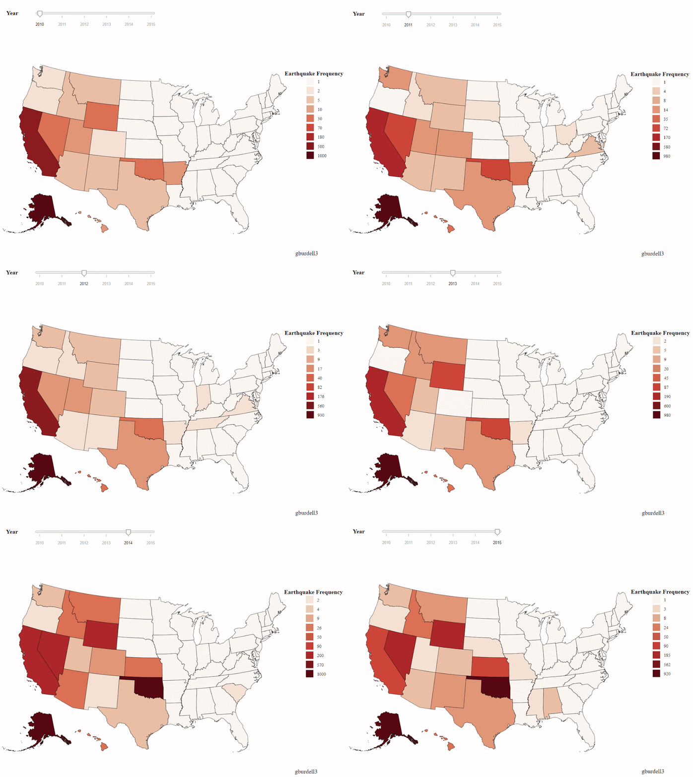
Figure 6a. Reference example for Choropleth Maps showing slider interaction for years 2010 – 2015
Figure 6b. Reference example for Choropleth Maps showing tooltip for Wyoming

Q6 Deliverables:
The directory structure should be organized as follows:
Q6/
choropleth.(html/js/css)
state-earthquakes.csv
states-10m.json
- choropleth.(html /js /css)- The html/js/css file to render the visualization.
- state-earthquakes.csv – The datasets used to show the information of each state.
- states-10m.json – Dataset needed to draw the map.
Important: folder structure of the zip file that you submit
You are submitting a single zip file HW2-GTUsername.zip (e.g., HW2-gburdell3.zip, where “gburdell3” is your GT username), which must unzip to the following directory structure (i.e., a folder “HW2-gburdell3”, containing folders “Q1”, “Q2”, etc.). The files to be included in each question’s folder have been clearly specified at the end of each question’s problem description above.
HW2-GTUsername/
lib/
d3.v5.min.js
d3-tip.min.js
d3-scale-chromatic.v1.min.js
d3-dsv.min.js
d3-fetch.min.js
d3-simple-slider.min.js
topojson.v2.min.js
Q1/
table.png
barchart.png
sales.csv
Q2/
graph.(html / js / css)
Q3/
linecharts.(html / js / css)
linecharts.pdf
earthquakes.csv
explanation.txt
Q4/
interactive.(html / js / css)
state-year-earthquakes.csv
Q5/
stacked.(html / js /css)
earthquake.csv
Q6/
choropleth.(html / js / css)
state-earthquakes.csv
states-10m.json


